Data Visualization Portflio
This is a portfolio of coding challenges I have created for PP434: Automated Data Visualization for Public Policy. The simplest visualizations are at the top and the most complex are at the bottom.

CC1: Hosting
Task: Set up your own Github account and live page using GitHub pages; Add two charts using the vegaEmbed function. 1
CC2: Building.
Task: Build two separate charts using the “create” tool from Economics Observatory's "create" tool. Embed the two charts in your page.
I'll start with some good news:
Now for some not-so-good news:
CC3: Debating.
Task: Produce two charts that support or refute (or are related to in some way) a topic discussed at the Festival of Economics. Your task:
- Set out a topic that was discussed
- Make two charts that support or refute it or a related to an argument on this topic. This could be two that support, two that refute, or a mixture.
- Comment on what you find
On day 1 of the festival, the panel discussed UK Productivity, which the panelists argue is under-performing.
Richard Davies began the panel by mentioning that two heavy industries, steel and coal, have all but completely shut down in the UK. Most economists agree the manufacturing is a major driver of productivity. The UK was once famously the world's leader in manufacturing. Today, the UK lags behind its peers, both in europe and among high-income countries, in manufacturing.
The second chart shows the UK's spending on R&D as a share of GDP. The ECO panelists (and many ECO contributors) argue that the UK is under-investing in R&D. The chart below shows R&D spending as a share of GDP for G7 economies. Based on the rhetoric around this issue, I expected to see the UK near the bottom. In fact, the UK is in the middle of the pack, below the US, Germany, and Japan and above Italy, Canada and France.2 The UK is also the only country in the G7 that is steadily increasing its R&D spending as a share of GDP. Of course, this says nothing about the quality of the R&D spending.
CC4: Replication.
Task: Find a chart that a journalist, think tank, television channel or company has used. Your challenge this week is to replicate it, and then improve on it.
This chart initially appeared in an FT article on the Dollar:
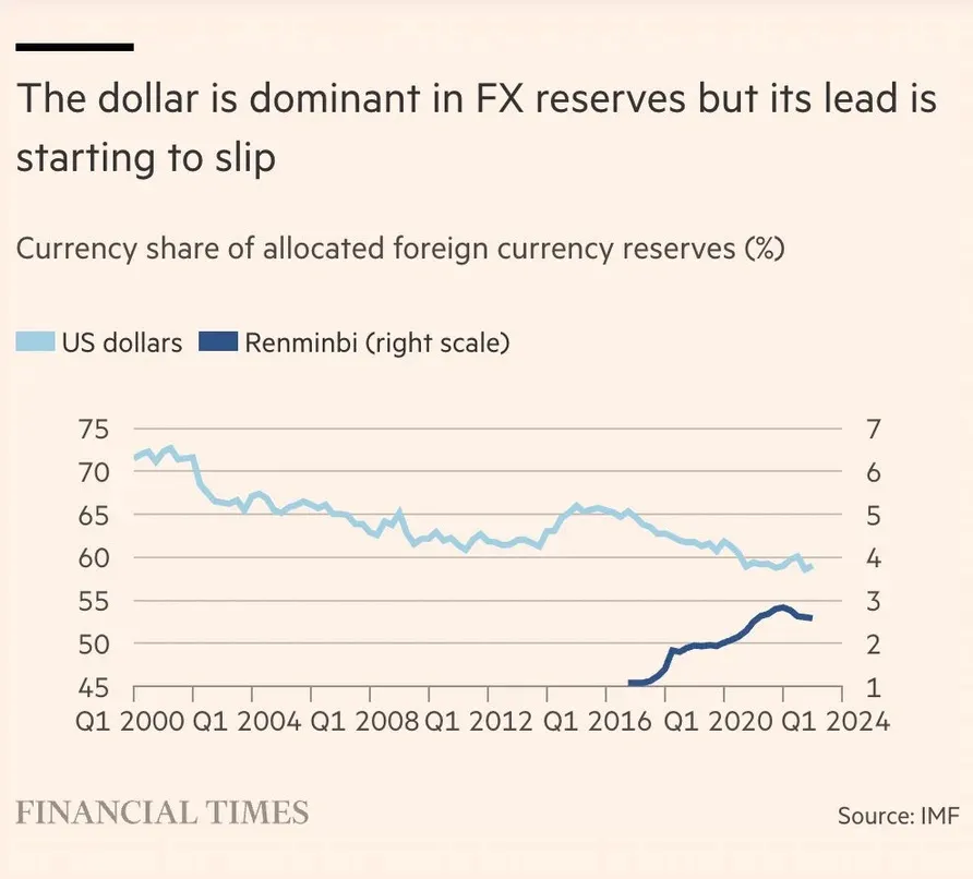
Yes, even FT is occasionally guilty of publishing the dreaded dual axis chart. If the viewer doesn't pay attention, he may think the Renminbi's share of global reserves is already just behind the dollar. FT released a revised version with the two series as a trellis chart with separate scales. This is an improvement, but I still think it obscures the distance that remains between the two currencies. Here is my recreation:
And my revised version:
When both series are on the same scale and other currencies are included, we can see how much the original chart exaggerates the Renminbi's share. It isn't even the fifth most held currency in the world. The latter claim about the Dollar slipping is true - we can still see that the dollar doesn't dominate FX reserves like it once did.
CC5: Scraper.
Task: Scrape a website using Pandas read_html or beautifulsoup. Then clean the data and create a plot.
For this plot, I scraped Basketball Reference to find player statistics from this season. Here's a notebook with the code I used. I created the plot below, which shows every player organized by team and ranked by an advanced statistic called value over replacement player, or VORP.3 To show the distribution of talent across the league and across teams, I show each team's best player, team average, and team average without their best player.4
CC6: Loops. Build a Dashboard
Task: Use the ONS API to batch download nine different series. Save these to your GitHub account, and use these to supply the data to nine charts on a theme or themes of your choice.
I batch downloaded time series from the ONS's Labour market statistics dataset. I created a "dashboard" using Vega-Lite's facet feature. The dashboard is meant to provide a brief overview of the UK's labor market trends.
CC7: Maps.
Task: Produce two maps and embed them in your portfolio page. Both should be of the same country, region, area, city:
- Map 1. Your base map.
- Map 2. A choropleth map.
I decided to map New York City. The first map shows the city's Community Districts and their Boroughs.
The second map shows New York's linguistic diversity. The map is colored by the third most commonly spoken language in each district. I mapped the third most common language because English and Spanish are the most common in nearly every district.5
CC8: Analytics Charts.
Task: Produce two charts that use advanced analytics.
My first analytics chart is from my final project. More than any other visualization, it shows thesis of my project: areas that under-supply housing have higher rent growth. We can also observe regional trends.
For the next visualization, I returned to the life expectancy data I used for my policy memo on the subject last year. In it, I argued that life expectancy in the US is diverging by geography and by class. The decline and stagnation of overall life expectancy conceals a great deal of variation. Consider the density plots of life expectancy by county every four years. The distributions gradually become flatter and wider, indicating a widening gap between the shortest- and longest-living areas.
CC9: Big data.
Task: Produce two charts using the UK price data provided in class.
How much does a suit cost? I found every component of a mens suit in the UK price data. The chart below shows the average price of each component in that month. Clothing prices have more seasonality than I expected!
My next chart shows percentile bands of a 1-night stay at a hotel by UK region. The upper percentiles show extreme seasonality, peaking in the fall and spring (perhaps for booking summer and christmas vacations?). The middle bands stayed relatively stable until the recent post-pandemic inflation.
CC10: Interactivity.
Task: Produce two visualizations that have interactive elements.
For these visualizations, I continued with the life expectancy data. The first shows life expectancy by state from 2000 to 2019. Moving forward in time, we see how some states are living dramatically longer while other areas are stagnating.
The second variation shows inequality within states. The plot shows every county in the US, with the user able to select a state from the dropdown menu and highlight its counties. Life expectancy varies widely within some states.